Behind the Scenes

This year, I have learned many things about digital media. I've gotten more familiar with many programs such as Photoshop, Illustrator, and Premier. I have worked on countless fun projects, each project challenging me in a new way. Here are just some of the projects that I have worked on:

Table of Contents

Canadian North


Much of this semester was spent designing new graphics for the airline Canadian North. I designed a boarding pass, an evelope to go with the boarding pass, and a luggage tag.


I started off this proejct by researching what vintage boarding passes may have looked like. The original idea was to go for a look that was similar to the "Golden Age of Travel". I created multiple designs, changed the colour scheme, and constantly asked people what they thought looked good about the boarding pass and what could have been improved on.

boarding pass design with a luxerious style boarding pass design with a luxerious style

Eventually I realised that the vintage style that I had been going for didn't seem to work that well. During my research, I had noticed that Canadian North had been going for a modern look for a while, and I thought that I could try to design a boarding pass with a more modern feel to try and reflect their brand identity. After revising a few more drafts, I had come up with this desgin.
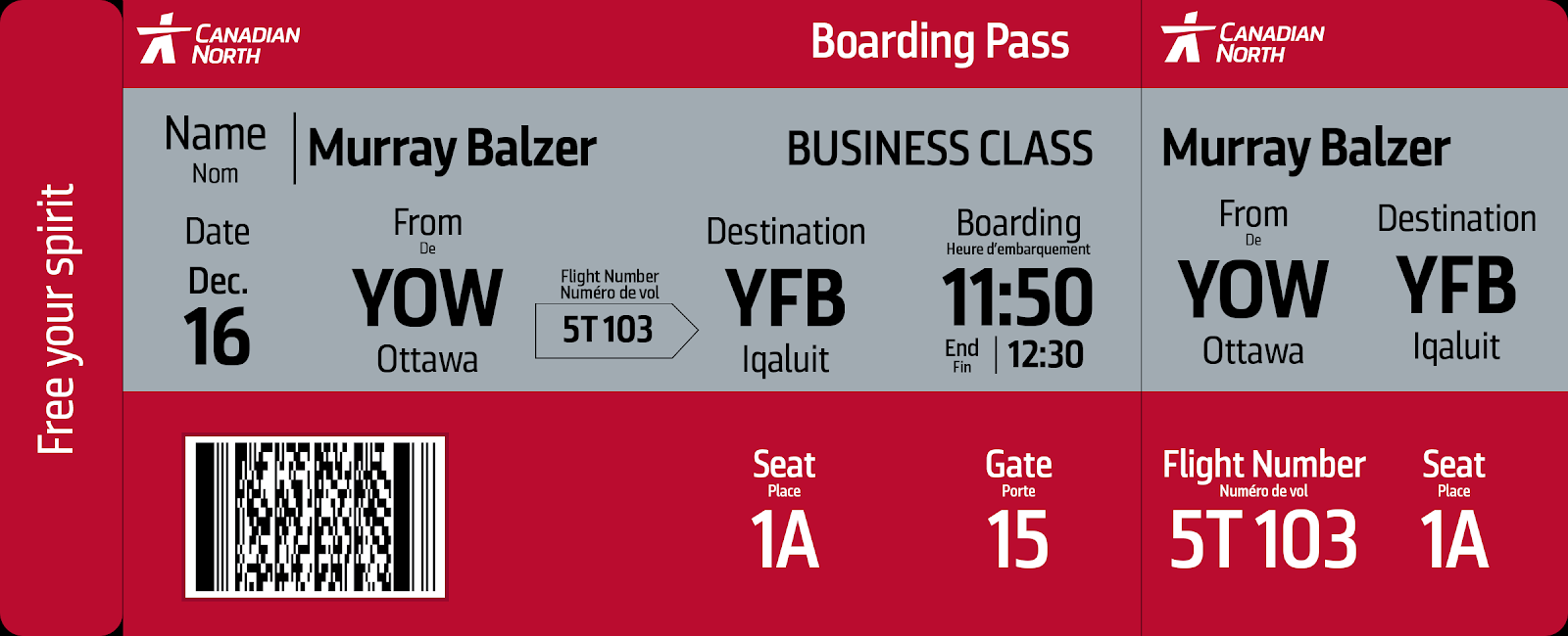

boarding pass with modern design

It was much easier to come up with a modern design than a vintage one. I was able to follow their brand identity guidelines, which includes the use of their official font, Renalte. This font would have been nearly impossible to use if I wanted to create a vintage boarding pass.

I also moved the barcode from the right side to the left. The reason why i did this was so that it could match up with a specially placed cutout on the envelope. This way, you didn't have to take your boarding pass out of the envelope when you were scanning it at the gate.
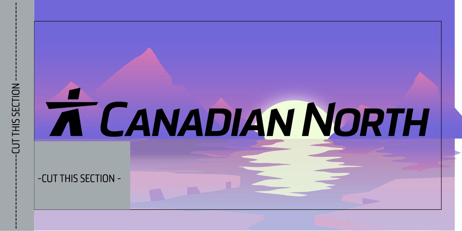

boarding pass envelope front design

I placed the logo on the horrizon as it would look like a "hidden" underline, which would emphasise the logo more.

The background of the envelope was a recolour of a design I had made last year. Since Canadian North was an airline that flew to some of the most northern parts of Canada, I thought that the design that I made of the arctic last year would be perfect.

I had also made a backside to this envelope.
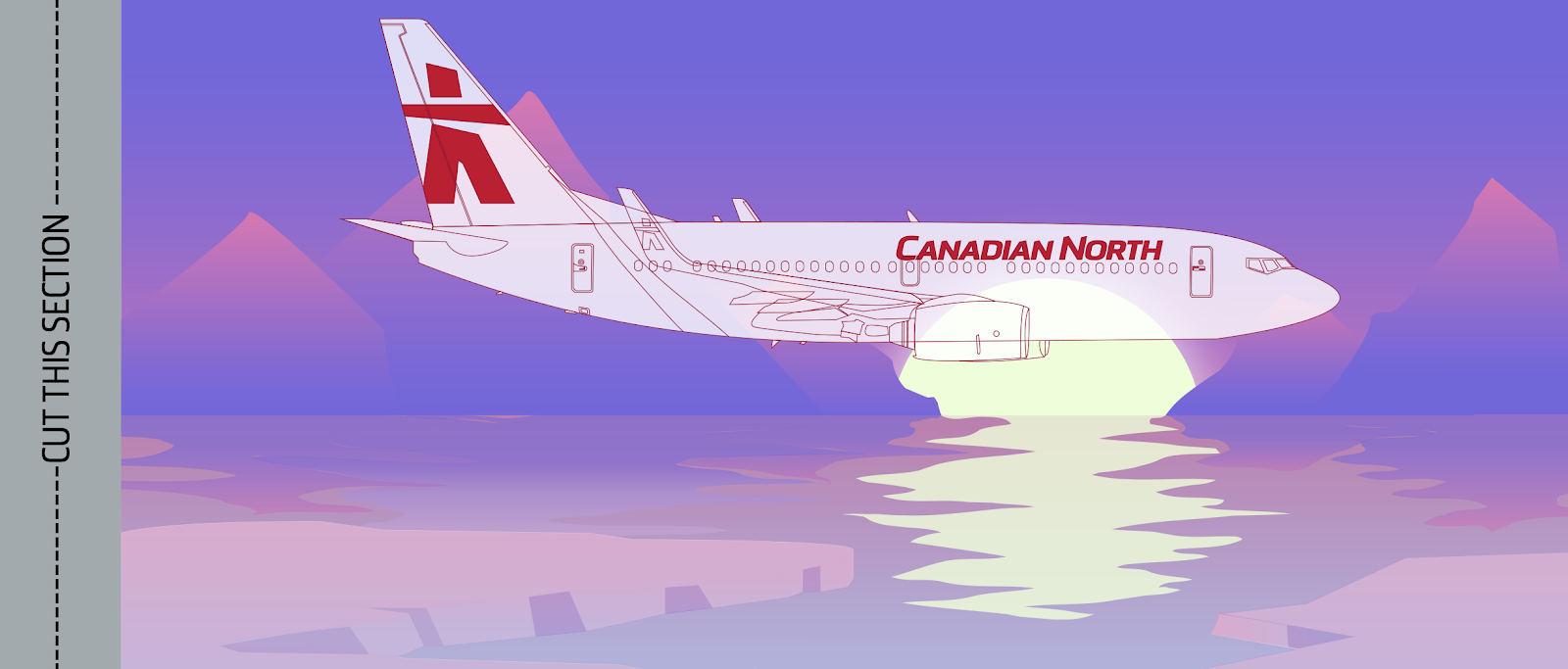

boarding pass envelope back design

For this art, I had traced an airplane and all of its features in order to have a "prototype" look.

After finishing the envelope, I realised I could have made this look cooler by connecting the front and backside of the envelope to make one continuous picture.

I had some time to spare after finishing the envelope, so I decided to try and make a luggage tag. Making the baggage tag was quite quick and easy as It didn't require a lot of thinking into how I should design it.


outside design of luggage tag inside design of luggage tag

The black should be cut out.

I had realised after the luggage tags had been printed that it wouldn't close very nicely. I had originally thought to put a string through both sides of the tag, but this would also lock it unless you cut the string. I would create a better system next time for closing the tag.

Here's how they turned out.


photo of luggage tag

Photography - Perrier


Another big assignment this semester was making a product photograph for Perrier.

Originally I wanted to follow a similar photograph idea as the following:

However, this idea did not turn out quite as similar as the one in the video.

I started off by creating test shots, playing around with lighting, exposure, and mist.

Originally, getting the condensation to stick to the bottle was very difficult. I thought that I could just spray some water onto it and it would stay, but it didn't. After a bit of experimenting, I learned that condensation sticks better to the can if I freeze it. Therefore I put the can into the freezer and left it there for about 30 mins.

I also tried sparying mist in the background, but after playing around with the shutterspeed, I realised that, with the lighting set up I had, I had to keep my shutter open for longer to get a good photo. This meant that I couldn't capture the mist in the background.

test photo of perrier can original photo used in final perrier advertisement

In the second photo, I managed to take a photo of the can that I was happy with. Then I imported this photo into Adobe Lightroom. and played around with the colours to make them pop more and be more vibrant.


editing the perrier photo in Adobe Lightroom

Next, I brought it into photoshop, and separated the can from the background. This way, i had control over the bottle, it's placement, and the background behind it. Here I centred it, and made the background black.


editing the photo in Adobe Photoshop

Next I generated a fog from photoshop and placed this into the background. Originally I wanted to have real mist in the background (as per the original video); however the shutter speed that I used was too high to capture the water droplets in air. Therefore I added them in post.


editing the photo in Adobe Photoshop

Finally, i added some colours to the mist, added some text, and the logo as finishing touches.


editing the photo in Adobe Photoshop

Here is the final result:


advertisement of perrier sparkling water